Hello again Block Editor Folks,
Here I am with a new and creative recipe on how to create an Image Comparison Slider Element using Kadence Blocks, 1 Teaspoon JS and Some CSS as per your taste.
Steps to Follow
This can be done in 2 Steps only, first construct the Structure and then use the CSS and JS below to convert the structure into the desired layout. Do note that CSS can be adjusted for various variables including arrow size, divider line color etc.
Creating Structure
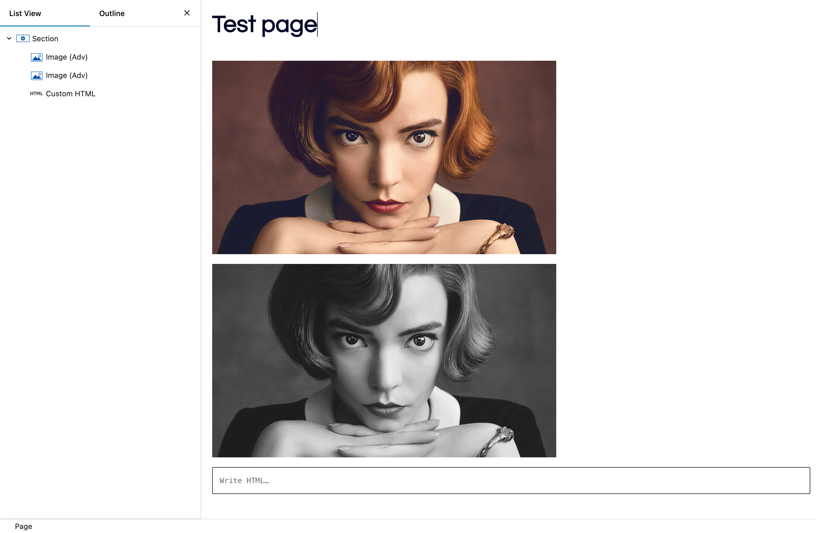
- Insert a Section Block with the class “
compare-container” , set width according to your need. - Add 2 Adv Images Blocks with CSS classes “
image-before” and “image-after“. Set Image styling from Image Block, like aspect ratio, border radius, caption, alt etc. - Add a Custom HTML block under images, (Inside
compare-container). It will be used for JS code give below.
Now after adding all this, your structure should look like this.
Adding Final Ingredients – CSS & JS
- Copy Below JS and add it into the Custom HTML Block added below images.
- Copy CSS and put it in Section Custom CSS Field
<script>
document.addEventListener('DOMContentLoaded', function() {
  const container = document.querySelector('.compare-container');
  const beforeImage = container.querySelector('.image-before');
  const afterImage = container.querySelector('.image-after');

  // Set container height to match the image height
  container.style.height = beforeImage.offsetHeight + 'px';

  // Create and append the slider
  const slider = document.createElement('input');
  slider.type = 'range';
  slider.min = 0;
  slider.max = 100;
  slider.value = 50;
  slider.className = 'slider';
  container.appendChild(slider);

  // Create and append the slider line
  const sliderLine = document.createElement('div');
  sliderLine.className = 'slider-line';
  container.appendChild(sliderLine);

  // Create and append the slider button
  const sliderButton = document.createElement('div');
  sliderButton.className = 'slider-button';
  container.appendChild(sliderButton);

  // Function to update clip-path and slider position
  function updateComparison(value) {
    const percentage = value + '%';
    afterImage.style.clipPath = `inset(0 ${100 - value}% 0 0)`;
    sliderLine.style.left = percentage;
    sliderButton.style.left = percentage;
  }

  // Update on slider input
  slider.addEventListener('input', function() {
    updateComparison(this.value);
  });

  // Initial update
  updateComparison(50);

  // Handle window resize
  window.addEventListener('resize', function() {
    container.style.height = beforeImage.offsetHeight + 'px';
  });
});
</script>:root {
/* Define color variables */
--slider-line-color: white;
--arrow-color: #5D5D5D;
/* Define size variables */
--slider-line-width: 5px;
--slider-button-size: 30px;
--arrow-size: 8px;
--button-padding: 5px;
--arrow-border-width: 2px;
}
.compare-container {
position: relative;
overflow: hidden;
width: 100%;
max-width: 100%;
}
.image-before,
.image-after {
display: block;
width: 100%;
}
.image-after {
position: absolute;
top: 0;
left: 0;
width: 100%;
height: 100%;
clip-path: inset(0 50% 0 0);
}
.slider {
position: absolute;
width: 100%;
height: 100%;
background: transparent;
cursor: ew-resize;
-webkit-appearance: none;
appearance: none;
margin: 0;
z-index: 2; /* Ensure slider is above other elements */
}
.slider::-webkit-slider-thumb,
.slider::-moz-range-thumb {
width: 0;
height: 0;
background: transparent;
cursor: ew-resize;
}
.slider-line {
position: absolute;
top: 0;
left: 50%;
width: var(--slider-line-width);
height: 100%;
background: var(--slider-line-color);
transform: translateX(-50%);
cursor: ew-resize; /* Ensure cursor reflects draggable effect */
pointer-events: auto; /* Make line interactive */
z-index: 1; /* Ensure line is below slider button */
}
.slider-button {
position: absolute;
width: var(--slider-button-size);
height: var(--slider-button-size);
border-radius: 50%;
background: white;
left: 50%;
top: 50%;
transform: translate(-50%, -50%);
display: flex;
justify-content: space-between;
align-items: center;
box-shadow: 0 0 5px rgba(0, 0, 0, 0.5);
padding: 0 var(--button-padding);
cursor: ew-resize; /* Ensure cursor reflects draggable effect */
pointer-events: none; /* Make button interactive */
z-index: 3; /* Ensure button is above slider line */
}
.slider-button::before,
.slider-button::after {
content: '';
width: var(--arrow-size);
height: var(--arrow-size);
border: solid var(--arrow-color);
border-width: 0 var(--arrow-border-width) var(--arrow-border-width) 0;
}
.slider-button::after {
transform: rotate(-45deg);
}
.slider-button::before {
transform: rotate(135deg);
}
Final Look
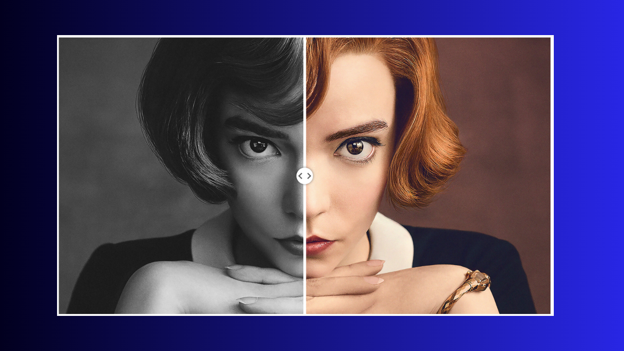
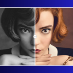
Here is how it should look on your end as well. (Images will be different ofcourse)






Hi Rahul,
First of all I just wanted to say massive thanks for sharing such an amazing work.
Here is my question:
I would like to build up a page that would display several before/after images using your coding system.
Following your instructions, I have managed to build up a row with a section which includes the 3 blocks – image, image and Custom HTML – and everything is working perfectly. But when duplicating the row, the new duplicated one will not work – I assume this is related to the relative position within the custom css?
Would you have any fix in order for my duplicated rows to work?
Many thanks,
Arnaud.
If I get it right, you are trying to add multiple Image after/before element on same page, In this case you will need to change classes to make sure JS code is not looking for same multiple classses.
In short it will be slightly different approach if you want multiple on same page.
Hi Rahul,
Sorry for the late reply and thank you so much for getting back to me.
Yes, Ideally, I’d like to have multiple images on the same page – I’m not really super techie when it comes to coding. Would you have an example to illustrate what you are saying?
Many thanks,
Arnaud.
Cureently a bit occupied in some project deadline but will write you once I get some time. Thanks
that’s great! thank you very much Rahul.