This has been added as a built-in feature inside the Kadence Block “Advanced Slider ” as a “Carousel” module. Use this only if you need more control over your carousel
Hello again Block Editor Lovers,
I recently got a project of Kadence Blocks where I needed to have a 3-column slider and one column will slide at a time. This feature is not yet available in Kadence Blocks and I do not want to add a new plugin just for a slide.
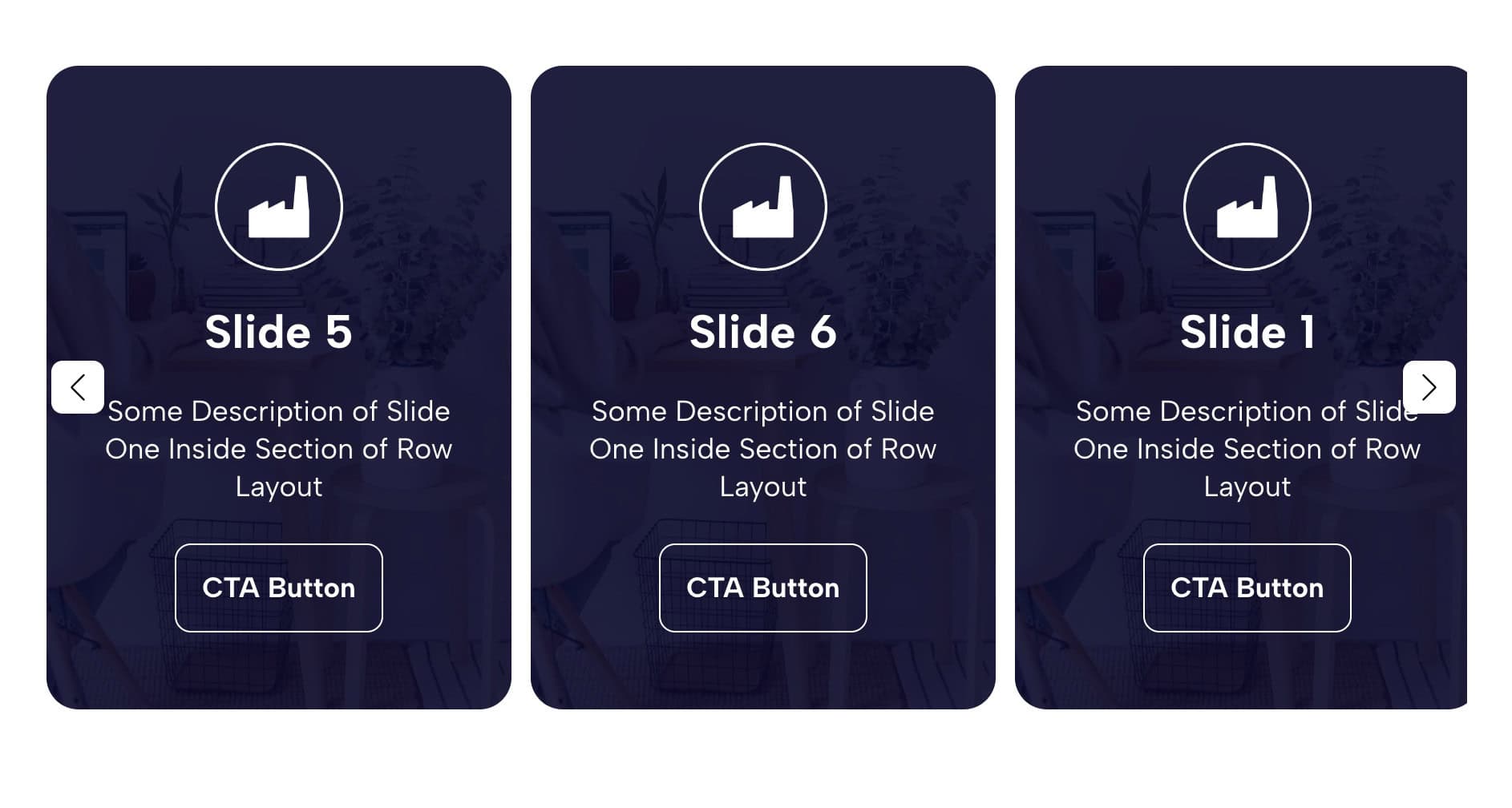
This is what I mean 👇
So here is what I did to create a nice-looking slide which also opens a lot of other possibilities as I have integrated Swiper into it, which means all Swiper Effects and Properties can be added into the code to modify the way it behaves.
Here is the link to check swiper possibilities
Now let see how I achived this
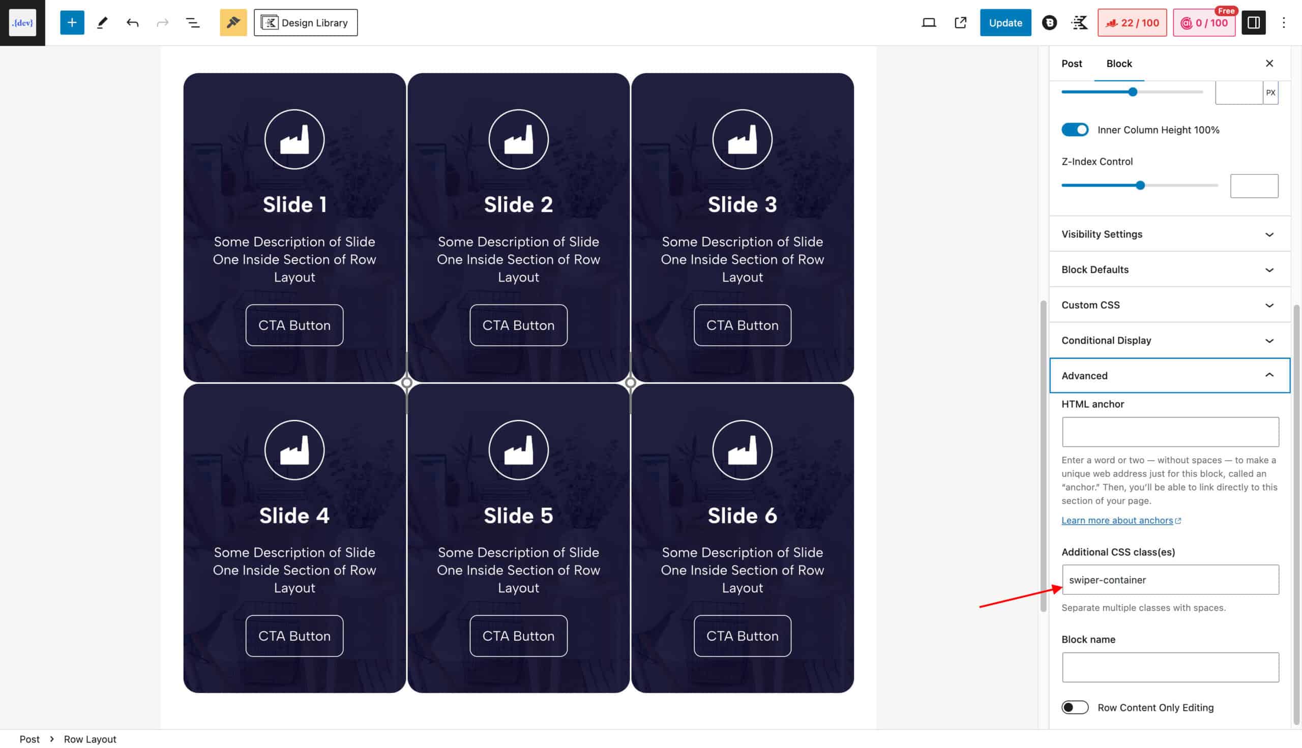
1. Add a Row Layout with “swiper-container”
Simply add a row layout with the same number of sections as your slide count, in my case, I needed 6, so I added 1 Row, 3 columns, and 6 sections. Make sure left and right padding is manually set to “none” or “0px” otherwise it creates an issue with alignment. By Default Row Layout block has some padding which is there but not visible.
Note: The number of columns defined in the Row layout has nothing to do with how the slides will look, those will be controlled by swiper parameters, which I will show you later.
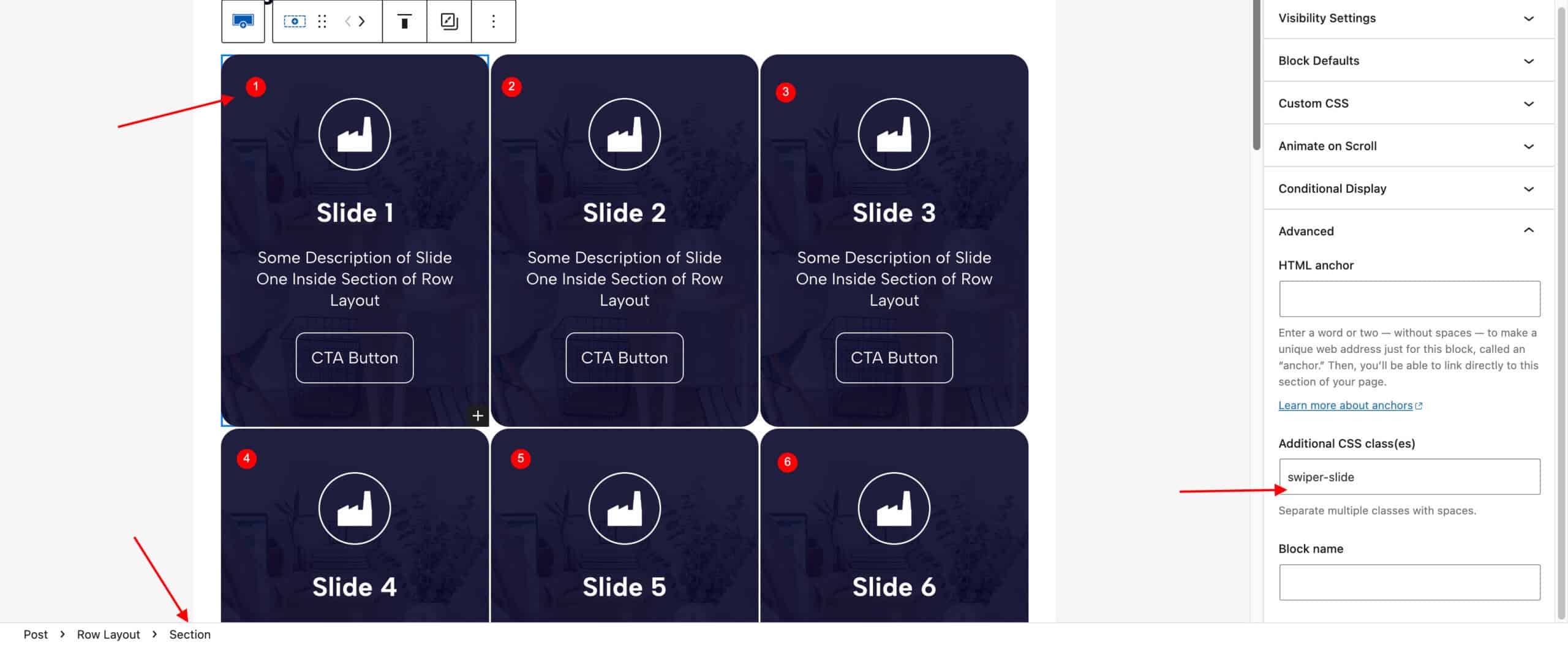
2. Add class “swiper-slide” in each section
Add the class “swiper-slide” in all sections of your Row, in my case, there were 6 sections, so each will have the same class of “swiper-slide”.
Now design all slides as needed, in my case, In just duplicate the same design.
3. Add Code in “HTML Block”
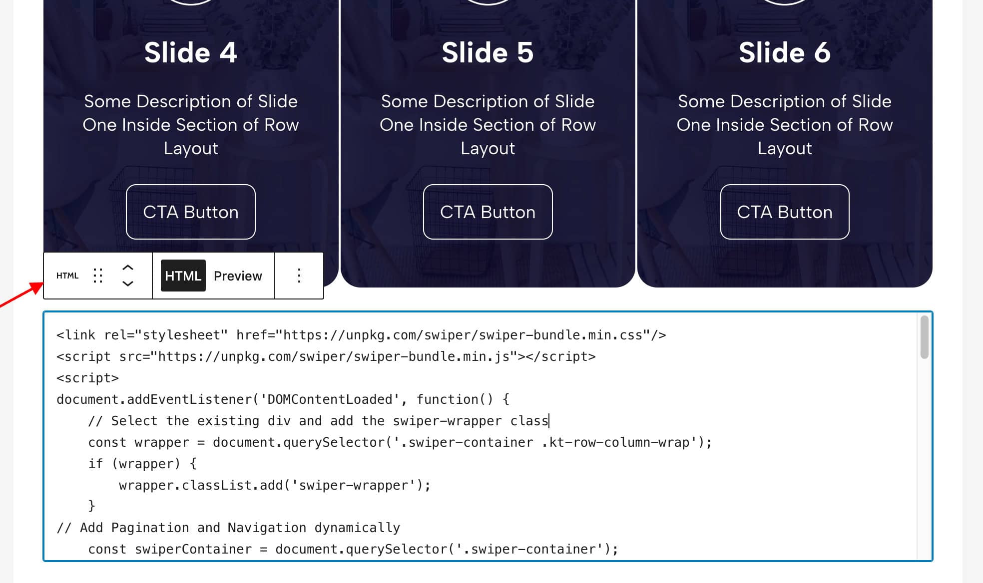
Now you just need to copy the code below and add it in the “HTML” Block and you are good to go. you can use a code snippet plugin to load this code but using HTML Block will give you benefit of loading it where and when you need it.
<link rel="stylesheet" href="https://unpkg.com/swiper/swiper-bundle.min.css"/>
<script src="https://unpkg.com/swiper/swiper-bundle.min.js"></script>
<script>
document.addEventListener('DOMContentLoaded', function() {
    // Select the existing div and add the swiper-wrapper class
    const wrapper = document.querySelector('.swiper-container .kt-row-column-wrap');
    if (wrapper) {
        wrapper.classList.add('swiper-wrapper');
    }
// Add Pagination and Navigation dynamically
    const swiperContainer = document.querySelector('.swiper-container');
    const pagination = document.createElement('div');
    pagination.classList.add('swiper-pagination');
    swiperContainer.appendChild(pagination);

    const nextButton = document.createElement('div');
    nextButton.classList.add('swiper-button-next');
    swiperContainer.appendChild(nextButton);

    const prevButton = document.createElement('div');
    prevButton.classList.add('swiper-button-prev');
    swiperContainer.appendChild(prevButton);

    // Initialize Swiper
    new Swiper('.swiper-container', {
        slidesPerView: 3, // Default slides per view
        spaceBetween: 10,
        centeredSlides: true,
        centeredSlidesBounds: true,
        centerInsufficientSlides: true,
        speed: 400,
        loop: true,
        autoplay: {
            delay: 3000, // Autoplay delay in milliseconds
            disableOnInteraction: true, // Continue autoplay even when user interacts with slider
            pauseOnMouseEnter: true,
            waitForTransition: true,
				},
				pagination: {
            el: '.swiper-pagination',
            clickable: true,
				},
        navigation: {
            nextEl: '.swiper-button-next',
            prevEl: '.swiper-button-prev',
        },
        breakpoints: {
            320: {
                slidesPerView: 1, // Mobile
                spaceBetween: 10,
            },
            768: {
                slidesPerView: 2, // Tablet
                spaceBetween: 10,
            },
            1024: {
                slidesPerView: 3, // Desktop
                spaceBetween: 10,
            },
        }
    });
});
</script>Some CSS you might want to try
/* Adjust size of navigation arrows */
.swiper-container .swiper-button-next:after, .swiper-container .swiper-button-prev:after{
	color:#000000 !important;
	background-color: #ffffff;
	padding: 8px 12px;
	font-size: 17px; /* Adjust size of navigation arrows */
	border-radius: 7px;

}


/* Adjust color of dots pagination */
.swiper-container .swiper-pagination span{
	background-color:#000000;
}

/* Adjust size of pagination bullets */
.swiper-container .swiper-pagination-bullet {
            width: 10px !important; /* Adjust width of pagination bullets */
            height: 10px !important; /* Adjust height of pagination bullets */
            cursor: pointer !important;
        }


/* Spacing between slide and pagination bullets */
.swiper-container .swiper-pagination {
  margin-bottom: -15px !important;
  margin-top: 15px !important;

}


/* In case you dont want overflow from right side*/
 .swiper-container {
        width: auto !important;
        overflow: hidden !important;
    }


/* To change color or active section*/
.swiper-container .swiper-slide-active .kt-inside-inner-col{
background-color:#1441E3;

}If you still need help in customizing it, just put details in a comment and I will reply with the answer.
See you in the next one..






Hi Rahul,
thanks for the great article, I am however running into a problem on the mobile screen where a scrollbar is added to the swiper. I do not want this but no matter what I try the scrollbar remains visible.
Do you have a solution for this?
Hello Edwin, You can create it with default Carousel Block, It will not render any scrollbar, Is there anything specific you need??
I am not sure which carousel block you mean, I don’t seem to have one..
But I used your code to create a slider out of a layout I made with different cards, built up from sections with images, text blocks and buttons. The layouts are done and it is working except for the scrollbar that I cannot get rid of in the mobile view.
There is a Block Called Advanced Slider, Inside that you will be asked to choose whether a Slider or a Carousel, You have to choose a Carousel and boom, you do not need this method.
This method is only needed if you want some extra swiper features that are not available in Kadence, like custom arrows, or any other Custom features.
If you still need help, just say Hii to me on facebook or in my Mail, and I will fix it for you. (No charges)
I sent you a message via Facebook messenger.
It is removed (has mixed section)
What do u mean? Is there anything wrong with the codes